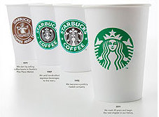
 By their signs ye shall know them. There's nothing more important for a consumer brand than its logo, the thinking goes. McDonald's wouldn't be Mickey D without those Golden Arches, formed by the gracefully rounded "M" of its name. You don't have to see the name on the Nike sneakers to recognize its graceful swoosh, or own an iPod to recognize the bite taken out of a Jonagold.
"Even though we have been and always will be a coffee company and retailer," says ceo Howard Schultz, "it's possible we'll have other products with our name on it and no coffee in it." (He says it, on video, here
That's already happening, frankly, with all the sandwiches, sweets and non-coffee beverages available at the company's 17,000 stores. But this goes a step further, dropping the Starbucks name and the word COFFEE from the logo completely.
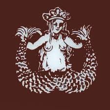
 "It's a gutsy move," says Terry Heckler, the Seattle graphic artist and ad director who designed the original logo some 40 years ago. Heckler lost the breasts on the first siren because they were sort of an in-joke at the beginning, but the mermaid, the siren, was always part of the logo. The company's founders wanted Starbucks to signify the spirit of adventure and exploring implied by a seafaring image, and the real Mister Starbucks, first mate on the fictional Pequod in Moby Dick, reinforced that.
What now? Even if the public can still connect the image of a mermaid with the company that sells Frappuccino, will that extend to other Starbucks ventures? Clothing? Automotive? Is this just another mood swing by a petulant, moody teenager, as Cornichon suggested in a post just six months ago?
Heckler says it's going to be interesting to see what Starbucks makes of its new nameless logo. "There's no question that the strongest brand signal is the name." If the siren herself (emblematic of adventure on the high seas, a symbol of the yearning for coffee) no longer makes sense, why keep her around? Without the ring of words, of the company's name and its flagship product, she's just "a princess with a crown on her head," Heckler points out.
The upshot? "A horrible misjudgment."
Leave a comment