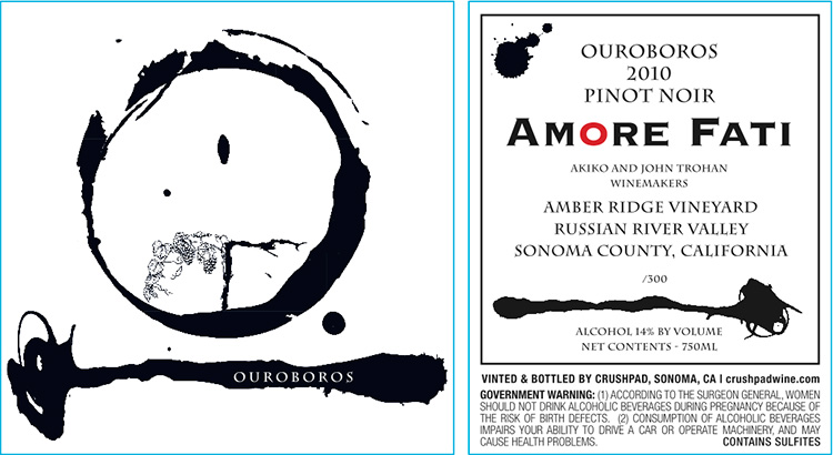
What you're looking at needs a bit of explanation. The image is on a wine label, that much you can figure out. Pinot noir, Russian River, Sonoma. But what does it all mean? I'm going to let the designer, John Trohan, who is also one of the wine makers, explain:
"The Ouroboros is an ancient symbol depicting a dragon eating its own tail. It represents the perpetual cycle and the renewal of life, death and rebirth--eternity and immortality."The design on the 2010 Ouroboros is a modern, simple interpretation based on the Japanese calligraphy style of shodō. The label features an ink-and-brush design surrounding an ancient grapevine, which is half alive, half dead--signifying the Tree of Life."
Okay, Mr.Trohan, if you say so. It's your candy store. Took me a little while to see the grape vine, since the circle (to me, to me) looked a bit lit a lopsided, sad smiley-face. But okay.
Amore Fati, the winery, bears a close resemblance to Amor Fati, "love of fate," a favorite subject of several online "fan mags." Never mind. This wine was vinified at Crushpad, a custom-winemaking facility which went broke last week, according to industry reports. Never mind; by then all 300 bottles of the Ouroboros was safely tucked away.
Now, why would Cornichon be writing about a winery's 25-case production? Because of the label! Because a distinguished panel of wine marketers selected this particular label for best-of-the-best honors in this year's International Wine Label Design Competition, IWLDC for short.
My good friend Paul Wagner, founder of Balzac Communications, is the driving force behind the label design competition and a tireless advocate of telling better stories about wine, not the least important element being the wine's label. Labels "have to attract attention from a distance like a billboard, and they have to provide reassurance on closer inspection," Wagner says. "They must be dramatic and yet comforting. And above all they have to communicate the unique message of the brand.
"A great label," Wagner concludes, "does all of this."
The Ouroboros is certainly dramatic. If the bottle were lying on its side, it would read as a perfect "10." But I think I personally prefer something more classic lines. Check out all the winners on the IWLDC site, and let me know what you think. (Comments on Cornichon.org are disabled; too much spam. Send an email to inyourglas AT gmail.com, or leave a comment on Facebook; thanks!). I'm impressed that a single design firm run by two woman in Chile won three mentions, two of them gold. Now, that's a story worth telling.
Leave a comment